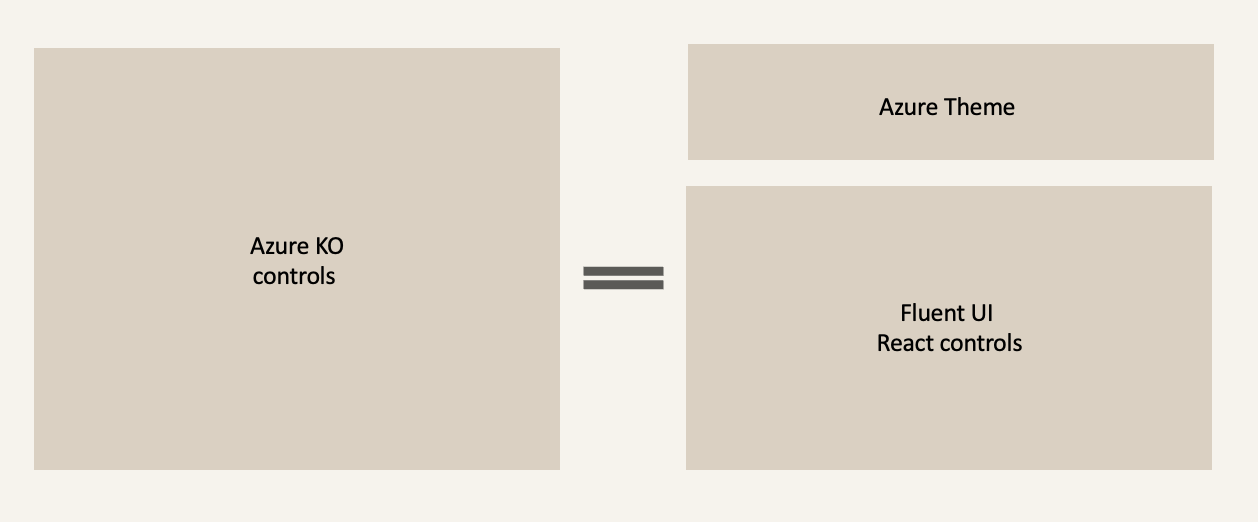
Azure Theme for Fluent

I created the Azure theme package for Fluent UI React web components, delivering brand-aligned, accessible, and scalable theming for both Fluent v1 and Fluent v2 that are being used in Azure everyday.
This work enabled Azure experiences to adopt Fluent UI’s design language and ReactJS control library while maintaining Azure’s unique identity across light, dark, and high-contrast modes.

What is Fluent UI?
Fluent UI Web Components provide a standards-based, lightweight ReactJS component solution for building accessible and brand-aligned user interfaces across Microsoft products (and beyond).
Theming is a critical aspect of this system, enabling dynamic customization & accessibility seamlessly integrated with Azure’s design language.
My work focused on designing and implementing Azure theme for FluentUI, allowing Azure to use Fluent UI controls within their React pages.
Situation
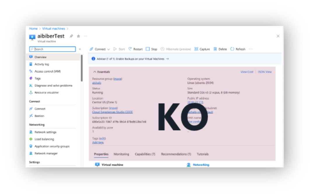
Azure needed to modernize its tech stack for web experiences from the legacy KnockOut (KO) code base.
Why? Failure to do so would lead to further accessibility / security risks. React is more attractive to prospective hires and offers “plug and play” capabilities with other libraries.
With over 15k blades (or pages), this poses a real problem without a strong technical strategy. One obvious approach was to utilize Microsoft’s internal react library, Fluent UI, as the design languages are similar.
However, adopting Fluent UI Web components introduced a challenge: how to style these controls for Azure branding, and maintain consistency between pages without building a separate SDK by hand, which would eat up engineering resources and fragment the design system.
Task: Bridge the gap
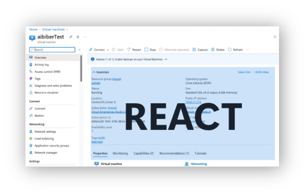
I found myself looking for a way bridge the gap with a theme, applied and styled on top of Fluent UI controls to visually match the existing KnockOutJS pages. Button matches button. Dropdown matches dropdown. New React pages visually look like existing pages.
Actions
Azure Theme for Fluent1
I created the first Azure brand-compliant theme for Fluent UI Web Components v1, ensuring visual consistency across KnockOut (KO) and React experiences. This work enabled seamless transitions for users navigating between KO-based pages and React-based pages.
To achieve this, I integrated Azure’s color palette and typography into Fluent’s token system, adapting it to support light, dark, and high-contrast modes and modifying control density. This required a lot of overrides, which at the time, would allow us to meet our goal of parity between experiences. These overrides aligned with Azure’s sub-theme standards at the time, delivering consistency across the Azure ecosystem.

How did that go?
While we achieved parity between the old (KO) pages and the new (React) pages, we did encounter the occasional accessibility bug as the product aggressively worked on WCAG standards. These one-color-updates in our package proved painful for engineers, because they found themselves having to update all of Fluent instead of just the theme.
When Fluent 2 was released 2 years later, this was the perfect opportunity to improve upon the Azure Theme.
Azure Theme for Fluent2
I refactored the Azure Theme for Fluent UI v2 by leveraging its modern design token architecture and simplifying the implementation (goodbye overrides. Hello embracing Fluent 2 design). This also meant having to advocate for Azure stakeholders to let go of the old KO styling, and embrace where the company was going, which was Fluent2. We can’t keep overriding Fluent to look like we are in the past.
I moved theme assets to an external repository, @fluentUI-contrib instead of @fluentui, enabling easier updates by partner teams. I reduced complexity from v1’s extensive overrides to a single color object containing Azure brand colors, dramatically streamlining customization and future-proofing the system. Now engineers are relying on tokens and slots from Fluent instead of theme overrides to achieve the Azure Theme).


Impact
Adoption: Azure portals and dashboards now use Fluent UI Web Components with Azure theme
Accessibility: 84.91% of Azure services now have a passing accessibility grade
Consistency: Unified Azure’s visual identity across multiple SDKs
Fluent UI Theme packages (v1 & v2) have lifetime downloads of ~718K and ~2. 5K, reflecting broad adoption across Azure. My styled controls average ~3 million unique page loads per week.
