Bringing Coherence to Azure and beyond
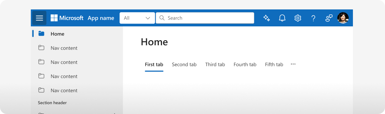
Microsoft products span a broad ecosystem, but customers should still feel like they are using one Microsoft. Coherence helps bring that vision to life by creating a shared visual and interaction language across products. Built as an extension of Fluent, it provides reusable components, patterns, and guidance that help teams solve common enterprise experiences consistently while still addressing product-specific needs. The result is a more familiar and predictable experience for customers and a stronger sense of connection across the Microsoft ecosystem.
What is Coherence?
Coherence is Microsoft’s design system extension for creating consistent, predictable enterprise experiences across products. Built on Fluent, it fills gaps with additional reusable UI components, patterns, templates, and guidance that help product teams solve common enterprise UX challenges while maintaining a shared visual and interaction language. Its goal is to make experiences easier to build, more consistent to use, and scalable across a diverse product ecosystem.
Web components, also known as custom elements, are a set of web platform APIs that allow you to create new custom, reusable, encapsulated HTML tags to use in web pages and web apps.
By utilizing our web components, product teams can avoid the need to recreate common UI elements from scratch. This leads to faster development, reduced engineering costs, and improved end-user experiences.
Why was the Lit framework chosen?
The Lit framework was chosen for its simplicity, performance, and flexibility to work in any framework or no framework at all. The library provides a set of tools for building fast, lightweight web components. It is also highly extensible, making it an appropriate foundation to build custom components that meet the specific needs of our product teams.
Lit is also well maintained with mature documentation and has a strong community of developers who are actively contributing to its development. This ensures that our library will continue to be supported and updated in the future.
How is this related to/different from FAST?
FAST also provides a set of reusable web components that implement Fluent design principles, as well as providing the entire FAST framework. Our library is a separate implementation of Fluent design principles, built on the Lit framework.
Will these work with React?
Yes! Our web components can be used in any framework, including React. We provide our full library as React components that come pre-packaged with all of the functionality you'd expect to work in your React applications. Review the React integration docs for more details.
Situation
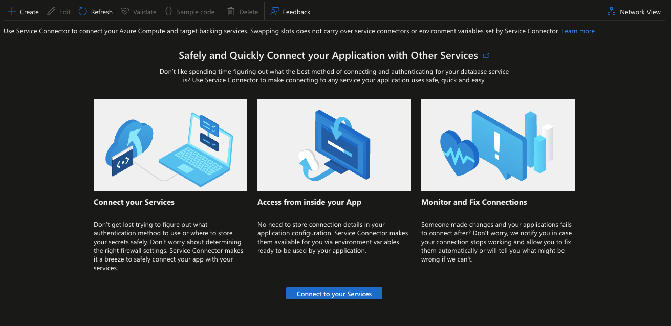
Azure needed to modernize its tech stack for web experiences from the legacy KnockOut (KO) code base.
Why? Failure to do so would lead to further accessibility / security risks. React is more attractive to prospective hires and offers “plug and play” capabilities with other libraries.
With over 15k blades (or pages), this poses a real problem without a strong technical strategy. One obvious approach was to utilize Microsoft’s internal react library, Fluent UI, as the design languages are similar.
However, adopting Fluent UI Web components introduced a challenge: how to style these controls for Azure branding, and maintain consistency between pages without building a separate SDK by hand, which would eat up engineering resources and fragment the design system.
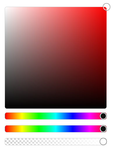
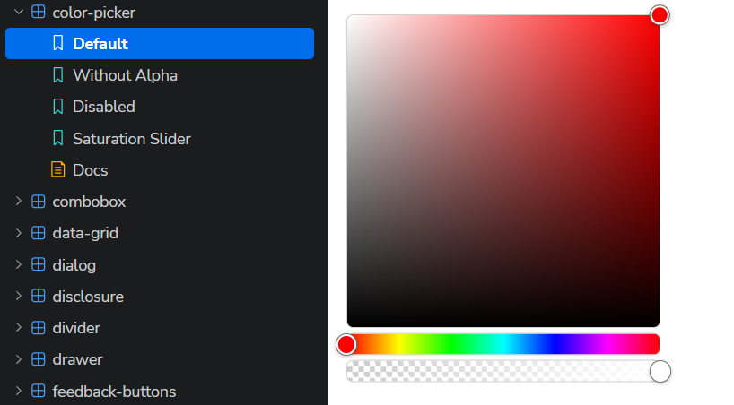
Color Picker Control Family
Project Overview
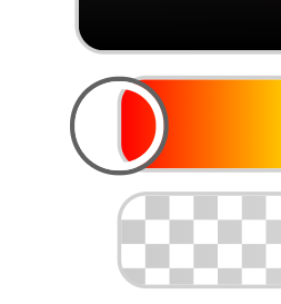
Designed and implemented a new color picker control family for Charm FUI, a TypeScript and Lit-based web-component library aligned with Fluent UI.
The control family includes:
fui-color-picker
fui-color-area
fui-color-slider
fui-alpha-slider
Code Plan
The implementation plan followed a four-pass architecture process:
Public API
Use HSV as the shared color model:
{ h: number; s: number; v: number; a?: number }
Provide separate controls for the color area, hue/value/saturation sliders, and alpha.
Support standalone child controls as well as nested controls inside the main picker.
State and Communication
Keep canonical color state in fui-color-picker.
Treat child controls as interaction surfaces.
Use slotted child components and bubbling native-style input and change events.
Re-emit picker-level color-input and color-change events with channel metadata.
Repository Consistency
Follow existing composite-component patterns from combobox, tabs, and tree.
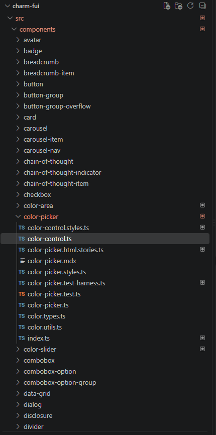
Use CharmElement, Lit decorators, per-component styles, registration files, test harnesses, and Storybook stories.
Keep public components in flat sibling folders under components.
Testing and Documentation
Add browser-based tests using @open-wc/testing and Playwright.
Support Chromium, Firefox, and WebKit.
Add HTML Storybook stories and narrative MDX documentation.
Document how consumers read the selected color through properties and events.
Implementation
The parent picker owns and normalizes the HSV color state. It synchronizes the state to its slotted children and ignores invalid or disabled child events.
The child components provide specialized interaction:
fui-color-area maps pointer coordinates to saturation and value.
fui-color-slider supports hue, saturation, and value channels.
fui-alpha-slider controls transparency with a checkerboard track.
The color area uses pointer capture so dragging continues even when the pointer leaves the visible color surface. The slider tracks use separate decorative elements from the native range inputs, allowing the thumbs to overhang the visible track edges like Fluent UI.
Iterative Improvements
During visual comparison with Fluent UI, the implementation was refined to include:
Fluent-style rounded corners and borders
Layered gray and white thumb rings
Thumb drop shadows
Solid thumb colors instead of transparent fills
Alpha-aware thumb transparency
Dynamic saturation and value gradients
Slider thumbs that overhang the track at minimum and maximum values
Slider widths aligned with the color area
Design-token corrections based on the repository's actual theme definitions
A structural correction also moved the child controls from nested folders into flat sibling folders, matching the existing repository convention and generated React wrapper paths.
Validation
The implementation was validated with:
TypeScript compilation
ESLint
Custom Elements Manifest generation
Storybook HTML build
Browser tests in Chromium, Firefox, and WebKit
Manual Storybook visual inspection
Direct browser measurements for slider and track alignment
The parent color-picker tests pass across all three browsers. The child component tests also pass functionally, although their small standalone test suites still need additional cases to consistently meet the repository's branch-coverage threshold.
Documentation
Added Storybook documentation covering:
Default color picker usage
Usage without transparency
Saturation and value sliders
Disabled state
Reading the selected color through:
the color property
color-input
color-change
The implementation intentionally does not include Hex/RGB text fields or a built-in preview swatch. Those values remain available programmatically so consumers can choose their own output UI.
Outcome
The result is a composable, event-driven color picker family that follows the repository's architecture while providing a foundation for future features such as keyboard support for the two-dimensional color area, richer color-format utilities, and optional consumer-provided value displays.
Task: Bridge the gap
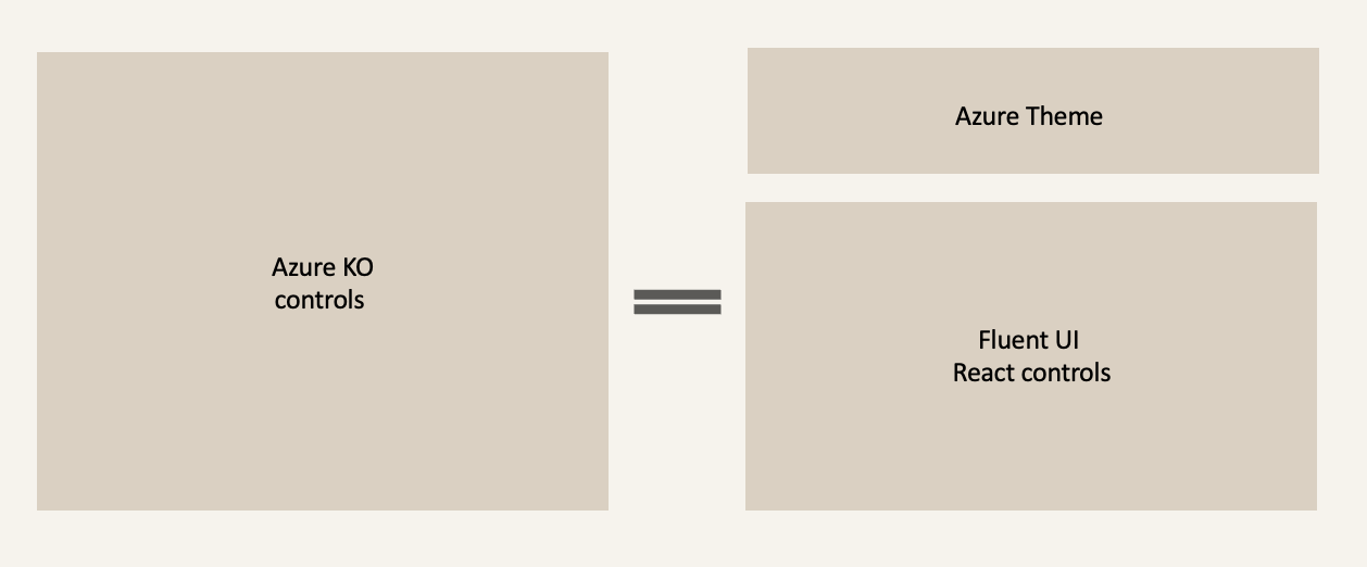
I found myself looking for a way bridge the gap with a theme, applied and styled on top of Fluent UI controls to visually match the existing KnockOutJS pages. Button matches button. Dropdown matches dropdown. New React pages visually look like existing pages.
Actions
Azure Theme for Fluent1
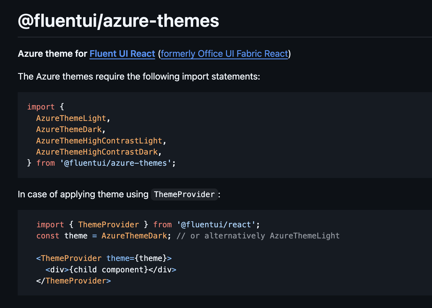
I created the first Azure brand-compliant theme for Fluent UI Web Components v1, ensuring visual consistency across KnockOut (KO) and React experiences. This work enabled seamless transitions for users navigating between KO-based pages and React-based pages.
To achieve this, I integrated Azure’s color palette and typography into Fluent’s token system, adapting it to support light, dark, and high-contrast modes and modifying control density. This required a lot of overrides, which at the time, would allow us to meet our goal of parity between experiences. These overrides aligned with Azure’s sub-theme standards at the time, delivering consistency across the Azure ecosystem.
How did that go?
While we achieved parity between the old (KO) pages and the new (React) pages, we did encounter the occasional accessibility bug as the product aggressively worked on WCAG standards. These one-color-updates in our package proved painful for engineers, because they found themselves having to update all of Fluent instead of just the theme.
When Fluent 2 was released 2 years later, this was the perfect opportunity to improve upon the Azure Theme.
Azure Theme for Fluent2
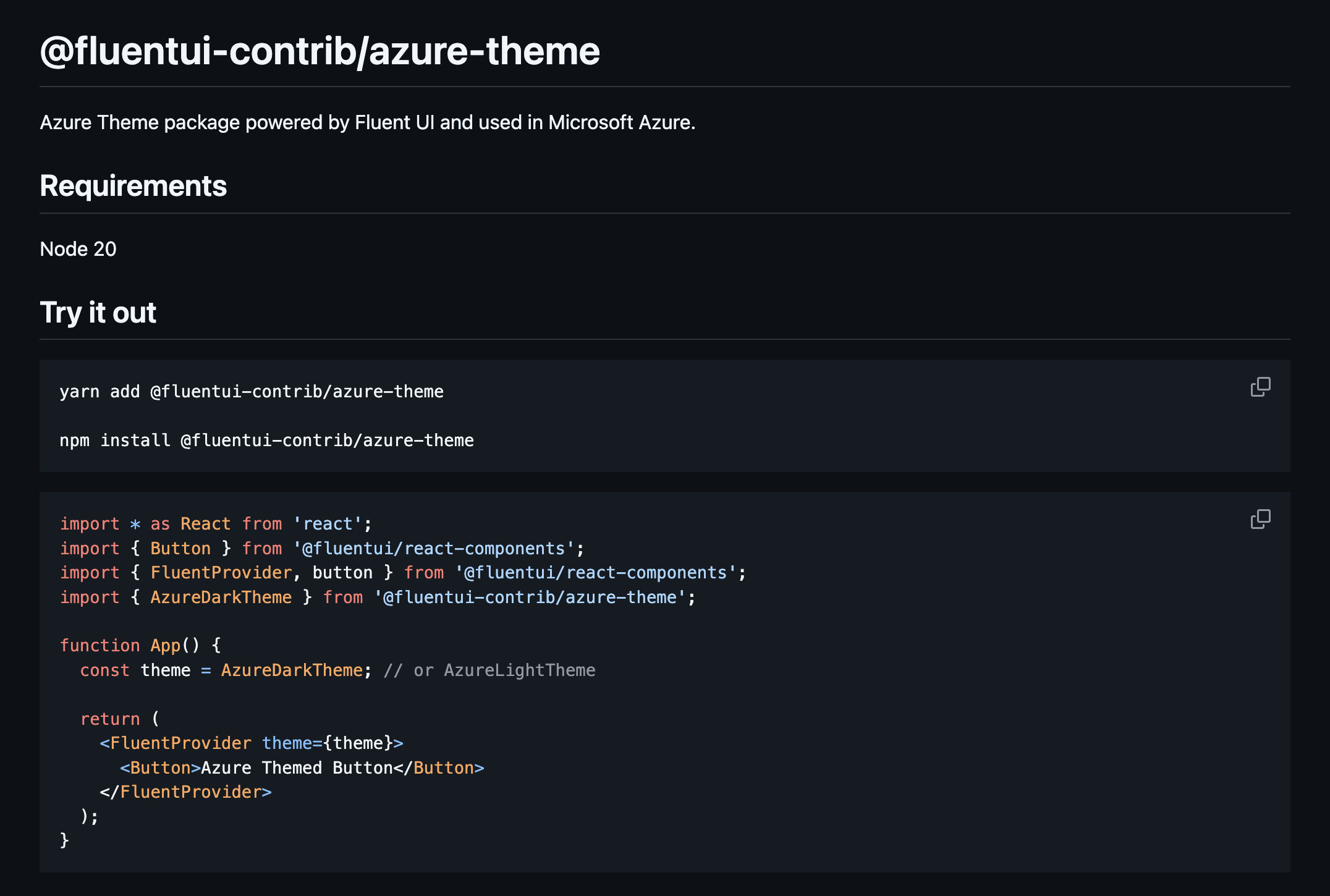
I refactored the Azure Theme for Fluent UI v2 by leveraging its modern design token architecture and simplifying the implementation (goodbye overrides. Hello embracing Fluent 2 design). This also meant having to advocate for Azure stakeholders to let go of the old KO styling, and embrace where the company was going, which was Fluent2. We can’t keep overriding Fluent to look like we are in the past.
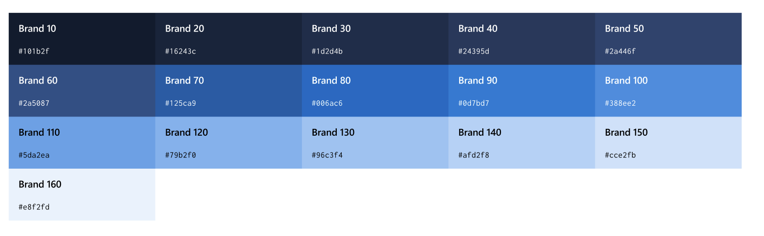
I moved theme assets to an external repository, @fluentUI-contrib instead of @fluentui, enabling easier updates by partner teams. I reduced complexity from v1’s extensive overrides to a single color object containing Azure brand colors, dramatically streamlining customization and future-proofing the system. Now engineers are relying on tokens and slots from Fluent instead of theme overrides to achieve the Azure Theme).

Impact
Adoption: Azure portals and dashboards now use Fluent UI Web Components with Azure theme
Accessibility: 84.91% of Azure services now have a passing accessibility grade
Consistency: Unified Azure’s visual identity across multiple SDKs
Fluent UI Theme packages (v1 & v2) have lifetime downloads of ~718K and ~2. 5K, reflecting broad adoption across Azure. My styled controls average ~3 million unique page loads per week.